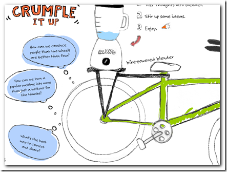
It appears that Humana is thinking an Adobe Flash page might generate some additional interest and perhaps some new customers?
And then you get to click and it does this:
Don’t really know the entire purpose of the graphics here, but for me, not impressed as navigation is not easy and hard to to read at points. I’d rather play a real game. BD


Funny, I found the site quite a refreshing change from the humdrum sites I see from most payers. Good to see some risks being taken.
ReplyDeleteThanks for the post. As one of the creators of crumpleitup.com, I have to admit that I was initially a little puzzled by it . . . but as I reflected, I think I get it. The fact is that you're dead right about a couple of things:
ReplyDelete* As an insurance marketing site, CrumpleItUp is flat-out weird (in part because it doesn't ever mention insurance)
* As a game, CrumpleItUp is as exciting as watching paint dry
* As an anthology of Gregorian Chants, CrumpleItUp is woefully inadequate (OK, I added that myself, but I know that you like a little levity around here!)
Luckily, it's not intended to be any of those things. CrumpleItUp is the new web site for a small group of people inside Humana called the Innovation Center. As the name implies, our focus is on the future. We're dedicated to the premise that today's sickness management system isn't enough. We're trying to build programs that actually create health. The most important design feature of our products and services is that they be fun and engaging first - and healthy second.
As a little part of a big company, our model is to partner with the smartest and most exciting people and companies out there. And that's why we built CrumpleItUp.com. It's not an insurance site. It's not even a consumer site. It's really a place for us to reach out to other people who have a passion for health and innovation. It's a place for us to showcase our people, our work and our thinking.
So if you're looking for an insurance marketing site, we've got those - good ones! Check out www.humana.com or http://staysmartstayhealthy.com.
If you're looking for games, check our our Games for Health microsite at http://humanagames.com.
But if your passion is health innovation, check out http://CrumpleItUp.com and join our Innovation Network on LinkedIn.
Thanks for the opportunity to comment. It's the great thing about social media - it allows dialogs to begin. I can see that you have a great perspective to share, and I'd welcome the chance to continue this conversation.
With all the best to you and your readers,
Greg
Thanks all for the comments. It's a bit of a strange world we live in today indeed! Having been a VB programmer, I do appreciate the work and efforts with Flash by all means as I know the work involved.
ReplyDeleteI see a lot of perhaps strange and different marketing scenarios out there and just try to bring things to light to create an awareness of what in the world is going on out there and otherwise might be missed.
I did this one a while back with Pfizer marketing Viagra and wondered why they needed a game too:)
http://ducknetweb.blogspot.com/2008/09/viagra-game.html
One of my big angles here though is to impress and further the education process though for technology and data, as it saves lives. This is one of what I think stands out as one of the best uses of technology from Vanderbilt University, early one detection of Sepsis, and I wonder why more are not jumping on this bandwagon as it can save lives!
http://ducknetweb.blogspot.com/2008/10/leadership-strategy-for-prevention-of.html
Read the links contained and see some really neat stuff being done with Silverlight, which I know competes with Flash, but there's a place for both if it saves lives!
Thanks for commenting and checking in!