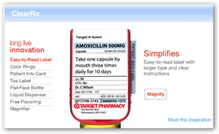
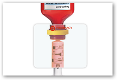
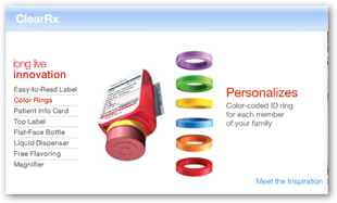
I have had a prescription in the new bottle and I do have to say I did look twice when I picked up my first one. The ClearRx program goes much  beyond the bottle though and entails an entire new procedure brought in by the pharmacies. They big keys to their success were in a couple areas, one instead of letting management make the decisions and roll it downhill, they used the suggestions and ideas of the front line individuals doing the job, the pharmacists.
Second, by using such a method, and I have to chuckle here a bit, they left out the usual PowerPoint presentations, you know the ones we all yawn at today. Nothing against PowerPoint as it is a great program, but sometimes the users over work it. CRM (customer relations management) software and other areas of IT had to enter the picture as well as training pharmacists on how to use the new system. What I see as a consumer is the branding portion, the bottle and not what is behind the scene, but all that has to take place for me to get my bottle too.
The entire program showed that frontline individuals CAN be trusted and DO have valuable information to contribute, unlike what we have seen so much of in the past where some establishments would never even think of using this technique and would not feel like frontline people could effectively contribute as well as a “management” individual. I like the oral syringe, makes it easy to measure too. BD
What many people might not realize is that good design work happens all the time inside companies, even companies that you would never associate with great design. The difference is that Target is able to get this great design out into the world. In looking at the ClearRx story, there are a number of lessons for anyone wanting to deliver a great experience.
1. Prototype Early
2. Gird yourself for a slog
3. Align efforts with your brand values
4. Customer experience is made of people!
Four Customer Experience Lessons from Target's ClearRx - Peter Merholz - HarvardBusiness.org
Related Reading:


0 comments :
Post a Comment