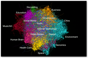
Sean Gourley and Eric Berlow visualize the connections of the thousands of TED talks done across the US. Both are regulars at various TED presentation conferences. The two put their heads together to show how math can help map in a visual way as how all the conferences connect and the distances. He points out that Healthcare and the Human Brain have a direct relationship and what is interesting when you look further at the big scope, see how removed other discussions are from Healthcare, like “business” being about the furthest away you can get. Below is a link to another one of Sean’s TED talks. One could look at this and perhaps determine the immediate disconnect here with what is being discussed at TED conferences in other words with the visual those in Healthcare with clinical work are far removed from wanting to interact with the business world and vice versa…maybe he’s on to something as to all the disconnect in Healthcare today?
Big Data and Rise of Augmented Intelligence–Humans and Machines Working Together as Partners
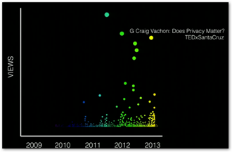
He further goes on and shows how this breaks down on one of the  individual area and notices the behavior with conversations in the environment area, wished he would have broken out healthcare. This shows where the younger generation interest lies versus the old, male versus female and so on. You can also find one of Sean’s videos that discuss the math used in the stock market and his warnings on dysfunctional algorithms at the Algo Duping Page and he tells you “they are not stable”…
At any rate this is a unique visualization giving us additional insight using the TED conferences in a big data way to see where the discussions and concern are and to what groups they matter. BD


0 comments :
Post a Comment