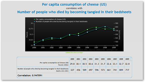
This is a funny page with making comparisons with queries on items that are not any way related just to prove a point that you can query any old data base with another and come up with some charts and real convincing stuff. This page is amazing and I think I have read some of these studies. I say all the time I used to be a query monster and that any couple of data bases can be queried together to create a new and these guys got my heart here! I love it. If you want more on this topic, scroll on down to my footer and watch video #1 about quantitated justifications for things not true or click here or here for more. Look at this chart, amazing is it not..look how close the numbers run:)

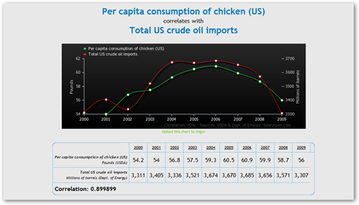
Look at how much chicken we consume as it directly relates to how much oil the US Imports!

Here’s a video from the author below that explains what this is all about with correlations. Some he says have meaning and some don’t and it’s up to us to figure it out and it sure seems we see stuff in the news like the charts above sometimes:)
Sometimes we don’t have a scientist to make that decision either but if it looks like people will read it, then it run:) BD


0 comments :
Post a Comment